Chaos Designs now has a look that feels as vibrant as the work itself.
This first slice turns the brand card into a living website direction: cosmic blues, rainbow ribbons, glassy cards, and a clear path into gallery browsing, product discovery, and quote requests.
- Gallery-first storytelling
- Friendly quote request flow
- Responsive shell ready for mobile refinements
Rich gradients and sparkle accents sit inside clean spacing so the artistry feels premium instead of noisy.
Bright, polished, and convention-friendly
The shell leans into the brand’s blue cosmic backdrop and rainbow movement, then balances it with readable typography and structured sections so customers can browse fast.
Ready for gallery, products, and quote approval flows
The navigation and page structure already carve out the main public experiences, so future work can plug into an established visual system instead of rebuilding the shell each time.
What the public site can spotlight first
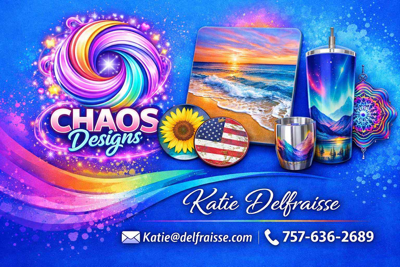
Custom Tumblers
Showcase wraparound artwork, aurora palettes, and personalized names with scroll-stopping product cards.
Coasters & Keepsakes
Highlight small-batch gifts with quick specs, bold photography, and easy quote prompts.
Event Favorites
Give convention shoppers a fast path from “I love that look” to “please make mine.”
Simple steps, more confidence
Browse the vibe
Lead with visual proof so visitors immediately understand the style range and finish quality.
Describe their piece
Guide customers through a lightweight quote form that feels personal without being overwhelming.
Approve with ease
Set up a friendly return path for customer login and future quote approval screens.